
Uncategorized
Where to Place Your Logo on Teamwear – Complete Visibility Guide
Jan
Designing teamwear involves many decisions, but logo placement is one of the most misunderstood. While it may seem like a simple design choice, logo positioning affects visibility, balance, comfort, and how a team is perceived during play, photography, and public appearances.
This guide explains the most common logo placement options on teamwear by miles teamwear, how each position functions in real sports environments, and what factors should be considered before finalising a design.
Why Logo Placement Matters
Logo placement influences how easily a team or organisation is recognised. In sports, uniforms are rarely seen in still conditions. Players are moving, bending, stretching, and often viewed from a distance. A logo that looks correct on a flat layout may behave very differently once the garment is worn.
Beyond visibility, placement also affects comfort. Heavy prints in high-movement or high-sweat areas can reduce breathability and cause irritation. Thoughtful placement helps avoid these issues while maintaining a clean, professional appearance.
Front Logo Placement (Chest Area)
The chest is the most commonly used area for logos because it naturally draws attention and faces the viewer during play and photography. However, chest placement is not a single option; it includes several distinct positions.
Left Chest Placement

Left chest placement is widely used across sports and uniform types. It creates a balanced and traditional appearance without dominating the design. Because it sits slightly away from the centre of the body, it is less affected by fabric stretching during movement.
This placement is often used for:
- Team crests or badges
- Club or school identities
- Training and travel apparel
Left chest logos are typically smaller as 2.5 inches or 3 inches and work best with simple designs that remain clear at reduced sizes.
Right Chest Placement
Right chest placement mirrors the left chest position but is used less frequently. It is often chosen when a design requires symmetry or when balancing multiple logos on the front of a garment. It is used from brand like miles teamwear.
This position can be effective when:
- The left side is reserved for a primary emblem
- A secondary logo or event mark is required
- A modern or unconventional layout is desired
Because it breaks from convention, right chest placement should be used intentionally rather than by default.
Center Chest Placement
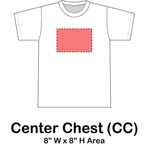
Center chest placement offers maximum visibility and is commonly used in match kits. Logos placed here are easily seen from a distance and during televised coverage.
However, this area also experiences the most movement and sweat. Large or dense prints placed in the centre can reduce airflow and feel heavier during intense activity. For this reason, center chest logos benefit from lightweight printing methods and careful sizing.
Full Front Logo Placement (Full Chest)
Full front logos cover a large portion of the front panel and are visually dominant. They are often used for promotional garments, supporter wear, or warm-up apparel.
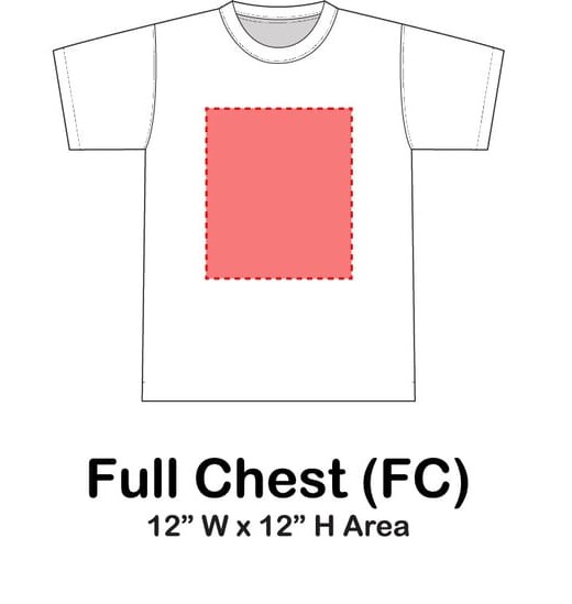
In competitive sportswear, full front logos require caution. Large ink coverage can limit breathability and increase heat retention. When used, designs should be adapted to minimise solid ink areas and allow the fabric to perform as intended.
Back Logo Placement
Back placements are important because players are frequently viewed from behind during gameplay. These areas provide excellent visibility when athletes are moving away from the camera or crowd.
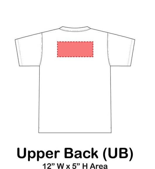
Upper Back Placement
Upper back logos sit across the shoulder blade area and remain relatively stable during movement. This makes them suitable for text-based designs, sponsor names, or secondary branding.
Because the upper back is less prone to heavy folding, logos placed here tend to maintain their shape and legibility.
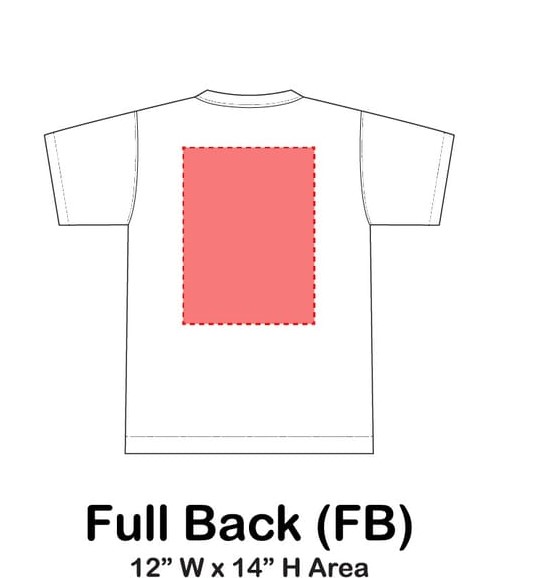
Full Back Placement
Full back placement provides the largest printable area and is often used for detailed designs or multiple logos. This position allows for clear visibility from a distance but must account for stretching when players bend or twist.
Designs for this area should be structured to remain readable even when the fabric moves.
Collar and Upper-Neck Placement
Small logos near the collar or upper neck area are subtle and typically used for reinforcement rather than primary branding. These placements are visible during close-up shots and contribute to a refined, finished appearance.
Because of the limited space, designs here should be minimal and uncluttered.
Sleeve Logo Placement
Sleeves are highly visible during movement, especially in sports where arm motion is frequent. Logos placed on sleeves are often noticed during running, passing, or shooting actions.

Sleeve placements work best with:
- Simple shapes
- Lightweight designs
- Moderate sizing
Overly large or complex logos can distort as the arm moves and may interfere with comfort.
Logo Size Considerations
There is no universal logo size that works for every garment or player. Effective sizing depends on:
- Garment size and fit
- Fabric stretch
- Player body proportions
- Viewing distance
A logo should appear proportionate across all sizes in a team, from youth to adult. Scaling designs rather than using fixed measurements helps maintain visual consistency.
Fabric and Printing Interaction
Logo placement should always be considered alongside fabric type and printing method. Performance fabrics behave differently than casual materials, and certain printing techniques add weight or stiffness.
For example:
- Lightweight prints suit high-intensity sportswear
- Embroidery works better on structured garments
- Stretchable methods reduce distortion in movement zones
Ignoring this interaction can affect durability and comfort.
Common Logo Placement Mistakes
Several issues appear frequently in teamwear design:
- Placing logos too low, reducing visibility
- Overcrowding garments with multiple marks
- Ignoring movement and stretch areas
- Using identical layouts for different garment types
Avoiding these mistakes improves both appearance and functionality.
Logo Placement by Sport Type
Different sports place different demands on uniforms.
1. Football and Soccer
- Key Placement Areas: For Football kits Chest, upper-back (between shoulder blades), sleeves, and sometimes shorts.
- Reasoning:
- Visibility during matches: Sponsors and team logos need to be visible to TV cameras, fans, and photos from multiple angles.
- Player comfort: Logos are usually embroidered or heat-pressed, avoiding irritation during high-contact movements.
- Tips:
- Large central chest logos are ideal for main sponsors.
- Smaller logos on sleeves or shorts help secondary sponsors gain exposure.
- Avoid placing heavy logos on areas prone to stretching, like underarms, to maintain durability.
2. Basketball
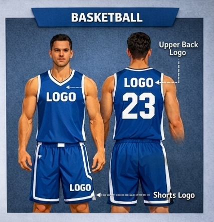
- Key Placement Areas: Front chest, upper back, shorts, sometimes near the collar or sides.
- Reasoning:
- Balance between jersey and shorts: Basketball is high-movement; logos shouldn’t restrict stretching or ventilation.
- TV exposure: Front chest and upper back are ideal for broadcast visibility.
- Tips:
- Keep logos minimal on areas that stretch excessively to avoid distortion.
- Consider side panels or shorts branding to maximize sponsor visibility without interfering with athletic performance.
3. Training Apparel
- Key Placement Areas: Upper chest, upper back, sleeves, or lower hem.
- Reasoning:
- Training gear prioritizes comfort and mobility over visibility.
- Lightweight, small logos prevent distraction or rubbing during exercises.
- Tips:
- Subtle branding works best for sweatshirts, hoodies, or compression wear.
- Consider reflective logos for outdoor training apparel for added safety and visibility.
4. Other Considerations Across All Sports
- Material Compatibility: Embroidery works well on thicker fabrics; sublimation or heat transfer suits lightweight, stretchable fabrics.
- Color Contrast: Ensure logos contrast well with the uniform color for maximum readability.
- Consistency: Maintain logo alignment across all kits for a professional, cohesive look.
Match Kits vs Training Kits
Match kits focus on identity and visibility, while training kits focus on comfort and durability. Using the same logo placement for both can compromise one or the other.
Separating these purposes allows each garment to perform its role effectively.
Balancing Team and Sponsor Logos
When multiple logos appear on one garment, hierarchy is important. The team identity should remain clear, while additional logos should support rather than overpower it.
Balanced placement helps maintain clarity and professionalism.
Final Thought
Effective logo placement is a combination of visibility, proportion, movement, and material awareness. By understanding how each placement functions in real-world conditions, teams can create uniforms that look cohesive, feel comfortable, and perform well throughout the season.